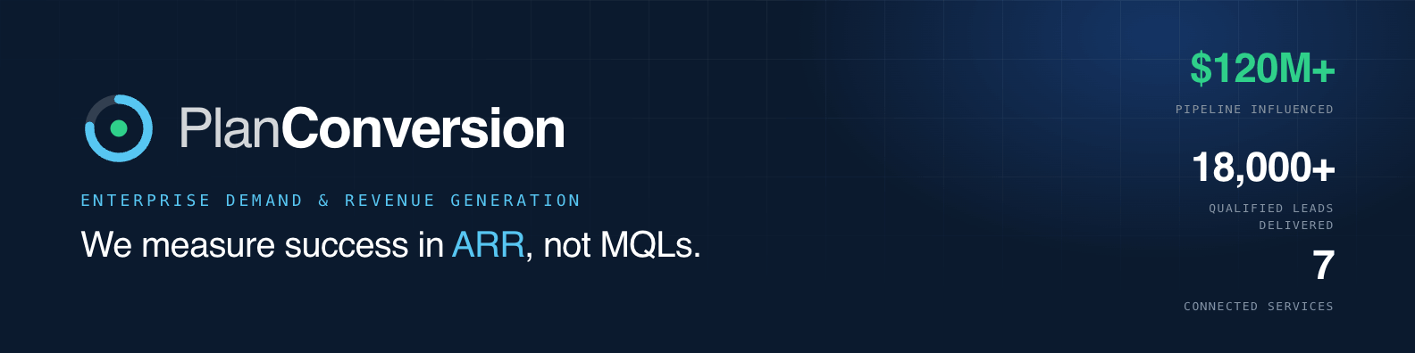
PlanConversion is a boutique demand & revenue generation agency for enterprise B2B. We connect strategy, demand and conversion into one system — and we measure success in ARR, not MQLs.
Turn enterprise marketing from a cost center into a predictable engine for pipeline and revenue.
Heads of Marketing, Demand Gen and Revenue at mid-market & enterprise B2B — accountable to a number.
More pipeline. Faster growth. One connected team across the entire funnel.
High-growth and results-driven. We lead with outcomes.
Data, systems, measurement. Specific over clever.
Boutique and high-trust. We demonstrate, never shout.
Forecastable pipeline, attribution the CFO trusts, marketing seen as a growth driver — not overhead.
MQLs that never convert, sales–marketing misalignment, and no clean line from spend to ARR.
Efficient pipeline at scale, a connected funnel across channels, and reporting that survives scrutiny.
Disconnected tools, channel silos, and pressure to do more with a flat budget.
Strategy, demand and conversion run as a single system — not seven disconnected tactics.
We report pipeline and revenue, not activity. The number on the board deck is the number we move.
Every program strengthens the system underneath it — so growth gets cheaper and more predictable over time.
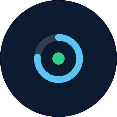
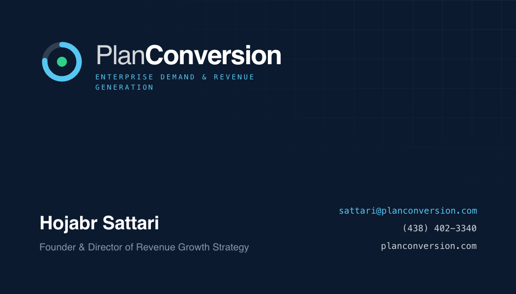
The wordmark sets Plan light and Conversion bold. The descriptor — Demand & Revenue Generation — is tracked to a single line, locked flush to the exact width of the wordmark on both edges. The mark is a conversion gauge: an open ring closing toward a solid core.
Keep clear space ≥ the diameter of the mark’s core on all sides. Never crowd the lockup.
Always reverse to white over photography, and add a subtle scrim or hold the mark over the image’s darkest, calmest zone. Maintain full clear space. Never tint the mark to match a photo.
The mark animates its own story — the ring draws on like a conversion rate climbing, the core “converts,” then settles into a calm idle pulse. Three motions cover every use.
Draw-on & breathe
Loading spinner
Conversion burst
Pure SVG + CSS, respects prefers-reduced-motion. Full interactive reference: open the animated mark →
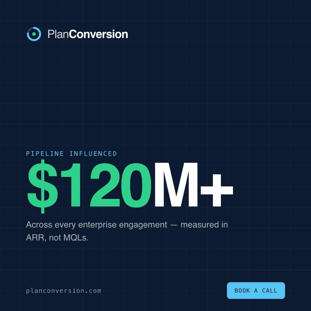
A deep ink foundation carries the premium weight. Azure is the confident primary; heritage cyan is the bright signal; growth green appears only on metrics — the one number that matters.
Gradients are atmosphere, never decoration. Keep them low-contrast and ink-anchored — a light source, not a rainbow. Never gradient the wordmark, body text, or fill a whole page edge-to-edge.
Space Grotesk gives the brand its technical-but-premium voice. Hanken Grotesk keeps long-form text warm and readable. IBM Plex Mono labels the data.
A small kit of repeatable devices keeps every surface unmistakably PlanConversion without leaning on the logo.
One consistent, geometric line set on a 24-unit grid. Every icon shares the mark’s logic — a clean azure stroke, square joins, and a single growth-green accent reserved for the “result.” Functional, never decorative.
Photography is confident and human, not stocky. Apply an ink duotone or a cyan-grid overlay so every image reads as part of the system. Swap these placeholders for real photography following the treatments below.
We sell on proof, so charts are a core brand surface. Neutral slate for context, azure for our work, growth-green for the outcome — one accent per chart. Clean baselines, generous space, zero chartjunk.
We speak like a partner in the room, not a vendor pitching. Plain words, real numbers, zero hype.
Open with revenue and pipeline, not activity. The result is the headline.
Specific numbers and clear systems beat slogans. If it can’t be measured, we don’t claim it.
No exclamation marks, no buzzwords. Premium brands demonstrate; they don’t shout.
From the first handshake to paid media and the homepage — every surface, on-brand.
Strategy, demand and conversion — built around the one number your board cares about.
Swag is restrained: one mark or one line per item, brand colours only. Quality over quantity — premium feel beats logo soup. Drop a real product photo into each placeholder.
Ready-to-run ad templates for the two channels enterprise demand actually lives on — LinkedIn and Google — plus paid social. Same system, every placement: ink-on-grid, azure CTA, one green proof point.
The LinkedIn company banner (1584 × 396) is covered under Applications → Social headers. Three banner angles — stat-led, statement and services — ship in the asset kit.
All paid templates ship editable in the Campaign Templates → file alongside white papers, one-pagers and case studies. Swap the copy, keep the system.
The system extends to product and web. A small set of tokens-driven components — buttons, fields, badges, cards and alerts — keeps every digital surface on-brand, accessible and unmistakably PlanConversion.
How an enterprise SaaS team rebuilt demand around revenue.
Turn marketing spend into forecastable pipeline.
Target, engage and convert named enterprise accounts.
All components inherit the brand tokens — ink text, azure primary, cyan/green accents, 8–14px radii, mono micro-labels. Maintain AA contrast and ≥44px touch targets. Pair with the website hero in Applications.
The rules that keep the brand coherent as it scales — legal usage, file naming, accessibility and a pre-flight checklist for anything that ships.
Write the company name as PlanConversion — one word, two capitals. On first prominent use in external materials, mark it PlanConversion™; the gauge mark and “Demand & Revenue Generation” descriptor are brand assets of PlanConversion. Don’t alter, recolour or recreate the mark. Third-party and client logos remain their owners’ property — use only with permission and never imply endorsement without an agreement.
Lowercase, hyphen-free tokens, underscores between fields. Always note colour variant and pixel size.
A brand director reviewed this guideline against a complete-brand checklist. Verdict and coverage below.
Vector and raster logo files, social and print visuals, plus the live application templates. Browse and grab everything from the Download Center →